Redesign and development work for the landing page of ParallelChain Foundation website (2023 legacy).
Project Overview
The brief was to rethink the way users first encounter the brand online. For ParallelChain, this meant transforming the homepage from a conventional static interface into an interactive, experience-driven entry point. Instead of immediately presenting information, users are guided through a tunnel-vision style journey that sets the stage for the brand narrative.
Design Concept
The entry experience leverages a 3D tunnel animation built in Three.js, where users are gradually guided through a visually dynamic space. The design communicates ParallelChain’s identity as forward-thinking, decentralized, and technically sophisticated:
▫️ Tunnel Animation: Users are visually drawn into the “world” of ParallelChain, mimicking a journey through a digital passageway.
▫️ Motion and Depth: Subtle camera movement and particle effects create a sense of depth and velocity, making the entry feel cinematic rather than static.
▫️ Guided Focus: The tunnel directs users’ attention toward the eventual landing area, reducing cognitive load and making the transition to the main site intuitive.
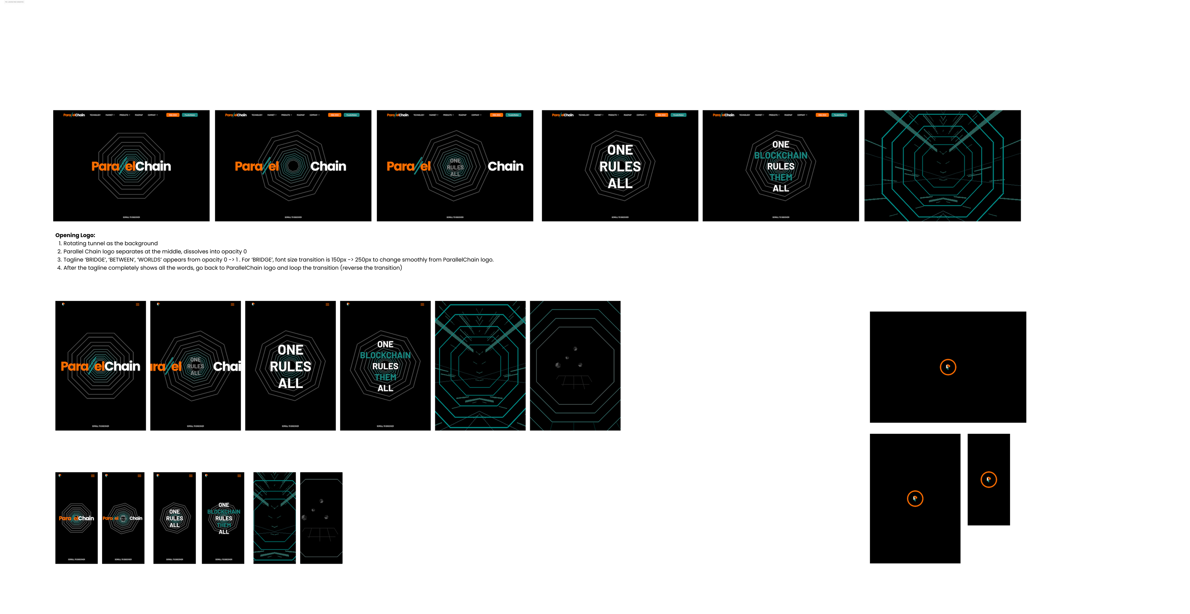
The initial design of octagon is modified to square to simplify the visual aesthetic
UI/UX Strategy
- Anticipatory Engagement: By delaying the presentation of standard navigation and content, users experience curiosity-driven exploration.
- Immersive Storytelling: Motion and 3D elements serve as narrative tools, telling the story of ParallelChain’s ecosystem through spatial metaphors rather than text-heavy explanation.
- Seamless Transition: The entry flow merges into the main information architecture smoothly, so the user does not feel disoriented when navigation begins.
- Performance Considerations: Optimized Three.js rendering ensures the experience remains fluid across devices, balancing visual fidelity with responsiveness.
Outcome
This immersive-first approach redefined the website from a static corporate portal to an experience-driven brand interface. Users arrive with a sense of context and curiosity, creating a lasting first impression that elevates engagement and reinforces brand identity.
Takeaways for UI/UX
▫️ Experiences before information can increase engagement and memorability.
▫️ Spatial and motion-based design can guide attention and communicate abstract concepts.
▫️ Cohesion of animation and content ensures the UX feels both innovative and usable.
Deployment for demo coming soon.
Elizabeth Kezia Widjaja © 2026 🙂