Personal portfolio site that is focused on visual display rather than text explanation of the works.
Purpose & Concept
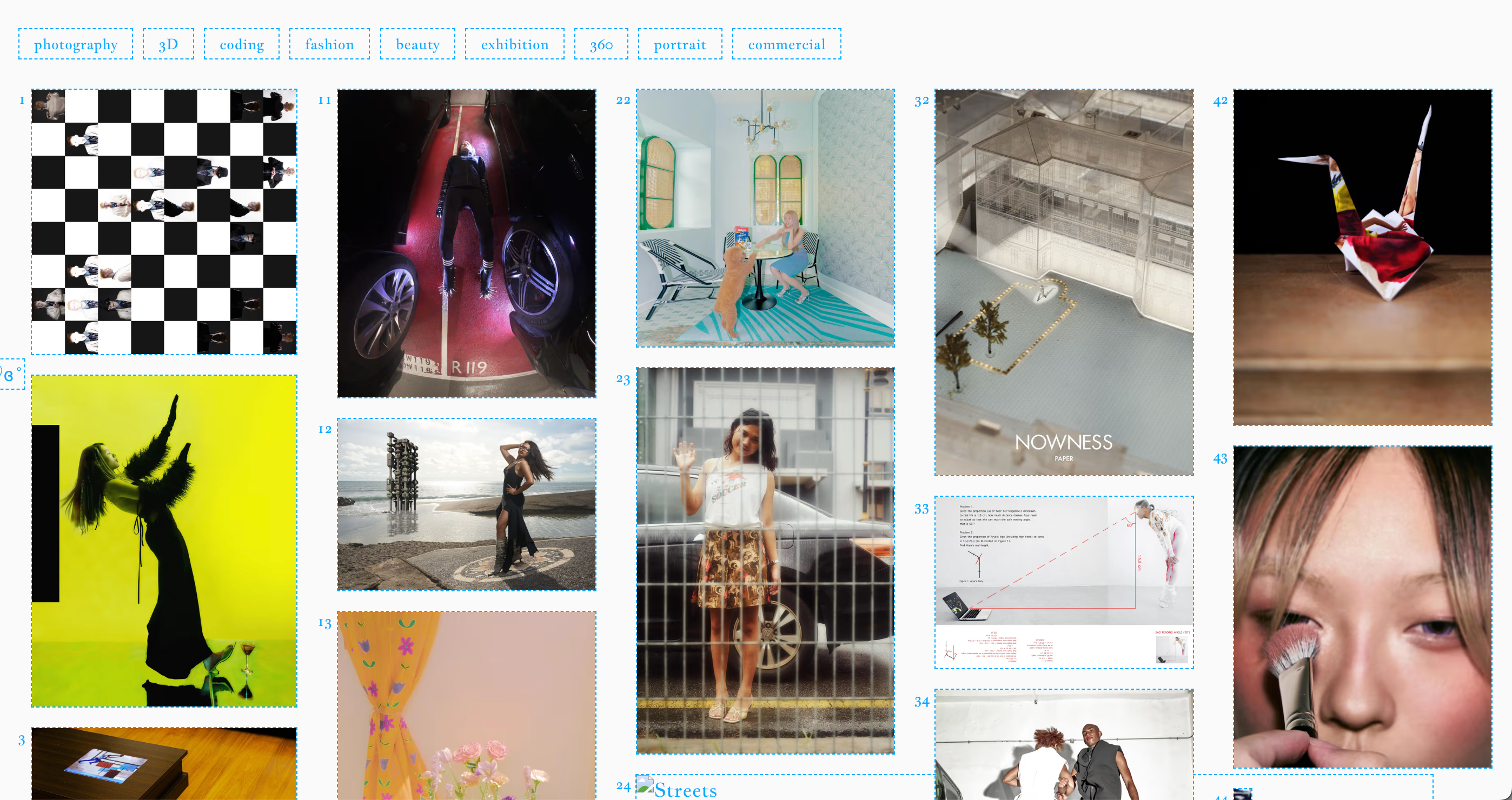
e-kezia.com is a personalized portfolio website designed to showcase my photography and related creative work. The design philosophy centers around a specific personality: a minimalist and angular approach to frame the photographs and user agency: allowing users to navigate content according to their personal viewing preferences. TheThe interface balances minimalist elegance with dynamic interaction, ensuring that the photography takes center stage without overwhelming the user with UI clutter.
Layout & Navigation
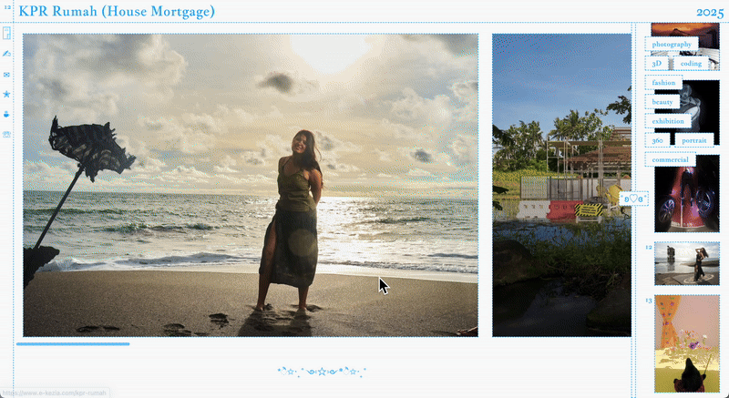
- Two-Column Design:
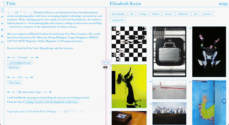
- Left Column: Contains descriptive content about the selected photograph or project, offering context and narrative that complements the visual work.
- Right Column: Displays the artwork itself, with a flexible drag-to-resize feature allowing users to adjust the width of the image gallery according to their preference. This encourages users to focus on the visual experience while maintaining access to context.
- Topbar Menu:
- Displays the title of the currently selected photograph.
- Acts as a navigation hub: hovering expands a full-screen menu, allowing users to quickly jump between works. This ensures smooth browsing without breaking the immersive experience of the main gallery.
- Filter Tags:
- Sticky filters on the right-side gallery allow users to sort and explore work based on categories, making the content more discoverable while maintaining a clean layout.
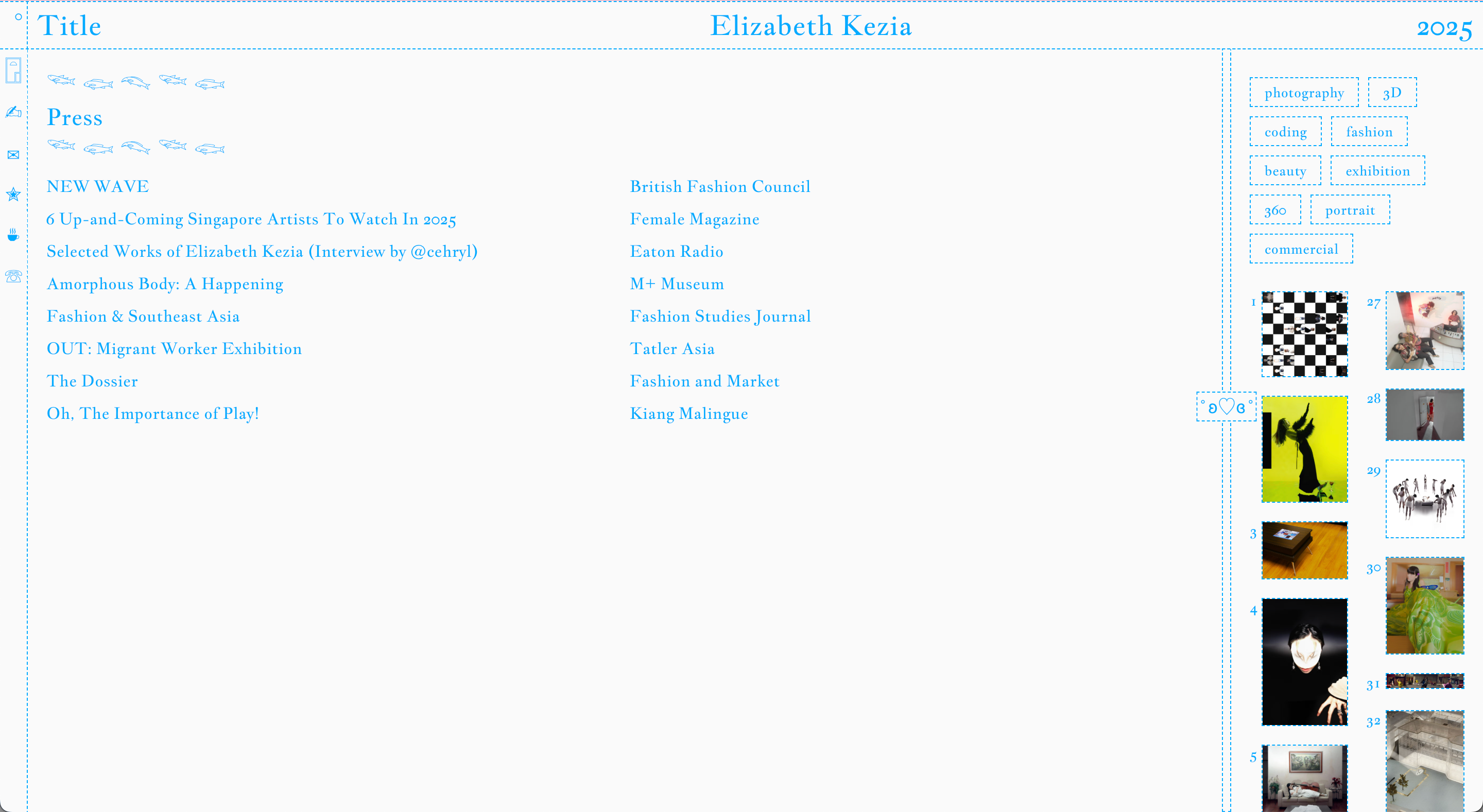
- Press Archive:
- A dedicated section for press mentions and features, emphasizing the artist’s professional footprint and credibility. This section maintains the same aesthetic as the gallery while organizing external references clearly.
Interaction Design
▫️ Drag-to-Resize Gallery: The horizontal drag functionality provides customizable viewing experience, letting users choose how much space the images occupy versus the descriptions.
▫️ Hover-Activated Topbar Menu: Minimizes visual clutter until the user wants to navigate, preserving focus on the artwork.
▫️ Smooth Scrolling & Transitions: Subtle animations enhance navigation between photographs, tags, and press archives, creating a polished and fluid user experience.
Visual Design
▫️ Minimalist, grid-based layout highlights the photography without distractions.
▫️ Neutral background colors ensure image content pops, while typography is clean and legible. Accent color of cyan-aqua blue is added with consideration that it is the sole color other than the default dark/light background, thus highlighting the accent color as the personality of the website.
▫️ Consistent spacing and alignment provide a balanced and professional feel across the site.
Development
Frontend Architecture
▫️ Framework: Built with modern frontend technologies (Next.js) that accommodates SSG, enabling component-based architecture for modular UI elements such as gallery cards, topbar, and filters.
▫️ Responsive Design: Two-column layout adapts to various screen sizes, maintaining readability of descriptions while prioritizing image visibility.
▫️ Drag-to-Resize Implementation:
- Uses a combination of mouse/touch event listeners and dynamic CSS grid/flex adjustments to resize the gallery in real-time.
- Ensures smooth transitions and prevents layout breaking on window resize.
▫️ State Management: maintains the current photograph selection in global state, enabling synchronized updates between the topbar title, gallery highlight, and left-column description.
▫️ Filter tags update gallery view dynamically without page reload, likely using a reactive state library or context API.
UI Components
▫️ Topbar:
- Interactive menu that expands on hover using CSS transitions and conditional rendering.
- Dynamically displays the currently selected photograph’s metadata.
▫️ Gallery & Image Viewer:
- Supports horizontal scrolling and drag-to-resize, with lazy-loading images for performance.
- Each photograph is linked with metadata to update the description panel in real-time.
Press Archive Section
- Structured to fetch and display content in chronological order.
- Receives GraphQL from Sanity to maintain press entries and link them to the artist’s work.
Scalability & Maintainability
- Modular component design allows easy addition of new galleries, photographs, or press entries.
- State management ensures minimal coupling between components, simplifying future feature integration like search, dynamic tagging, or multimedia content.
Elizabeth Kezia Widjaja © 2026 🙂